So you’ve got your product honed, ready for market and it’s the best it can possibly be. But none of that matters if your packaging doesn’t reflect how great your product is! Nobody is going to pick something off the shelf that isn’t eye-catching, has got a rubbish name or if it is not instantly clear what the product actually is. Here at Ideon, we’re here to give you some packaging inspiration so you can maximise the potential of your brand!
Not everyone can be a creative genius, so why not borrow *(ahem* steal…) some ideas from top brands who’ve already made it big? Here are just a few of our favourite packaging designs from well known companies and our tips on how you can recreate their success.
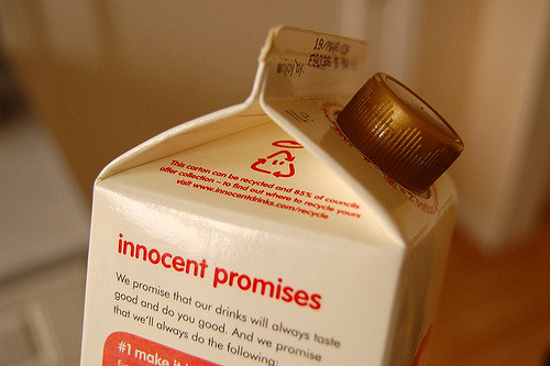
1. Innocent Smoothies
In recent years, Innocent has set a very high benchmark for carving out a distinctive company voice that every brand wants to emulate. Their product is simple and pure – just plain fruit juice and smoothies – and everything about how they package their product reflects this. They speak to their customers like an old friend, using jokes and very simple language to charm people into becoming regular customers. A great example is their health advice, which is required by law to be on food products. Most brands just write generic copy about having a balanced diet, but Innocent have added a little touch of humour to the end of theirs. “This smoothie is a source of Vitamin C which contributes to the normal function of the immune system. Enjoy as part of a healthy lifestyle and balanced diet. P.S. Eat your greens.” You can find this tone of voice throughout their whole company, whether it’s on the packaging or on their website.

2. Bonne Maman
Bonne Maman, a French brand, is a great example of how a company can use simple products to tap into what we aspire our lives to be. As soon as you look at a Bonne Maman jar, you imagine country picnics in the sun, the tempting smell of a French boulangerie and browsing market stalls in traditional villages. No, just us?… You know just by looking at the packaging that the food product inside is going to be rustic and homemade; probably made using an old family recipe. Or that’s what the manufacturer wants you to think! The traditionally shaped jar just adds to the overall rustic, vintage feel of the brand, right down to the red gingham lid that represents a picnic blanket.

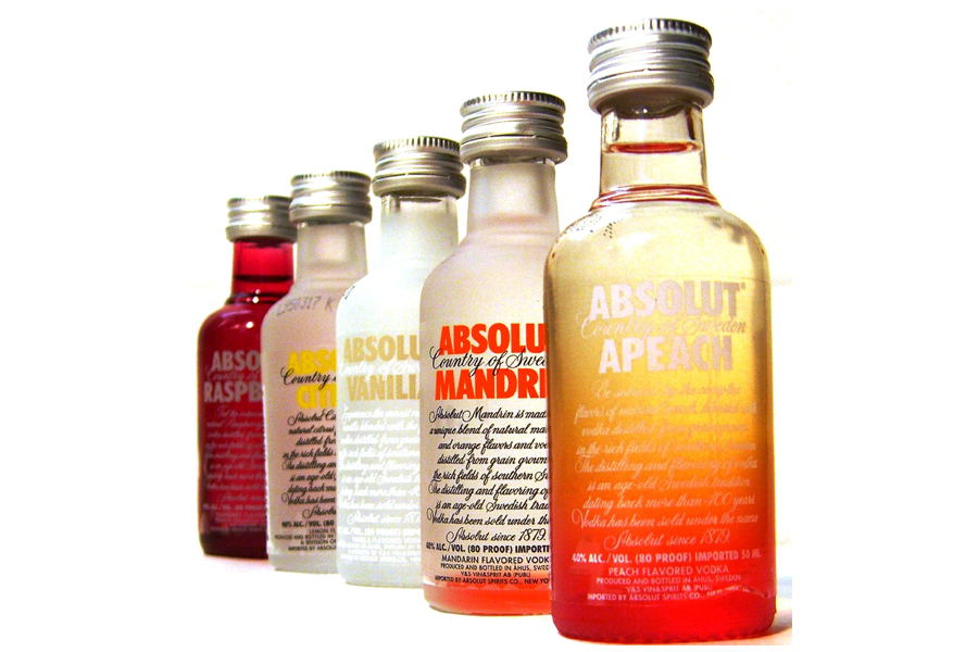
3. Absolut Vodka
In contrast to the traditional, homely design of Bonne Maman, Absolut Vodka packaging is the very essence of modernity! Their logo is simple, yet very prominent on their bottles, and each flavour is represented by a different colour. The fact that their bottles are wide, compared to other alcoholic drink brands, also makes them stand out on the shelf.

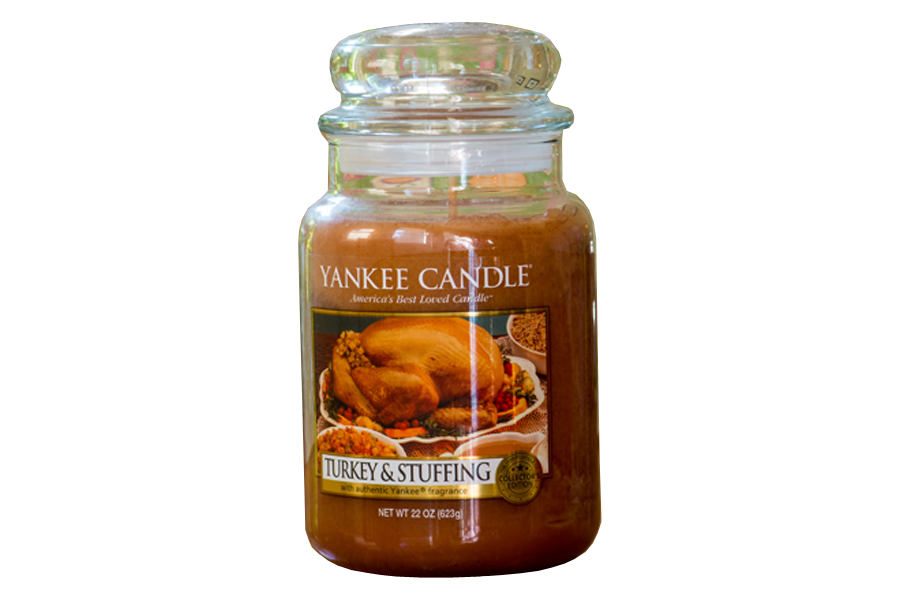
4. Yankee Candle
The top fall back Christmas present; Yankee Candle have got the luxury candle market all wrapped up! Some of this success can be brought back to their packaging. As you may know, Yankee Candle have a massive range of different fragrance varieties, each of which is represented by a tempting lifestyle image on the front of the glass jar or plastic packaging the candle is placed in, just like this intriguing Turkey & Stuffing scented example. Our mouths are watering… As well as the appealing nature of their labels, Yankee Candle are able to charge increased prices for their products by using high quality glass jars to package their candles in. The jar in itself is a high value item that can be reused, so when you add a delicious smelling candle, it becomes even more appealing to the customer who will be willing to pay above the normal price range for it.

5. Reggae Reggae Sauce
Best known for being the breakout star from television’s Dragon’s Den, Levi Roots and his Reggae Reggae Sauce have gone from strength to strength – but don’t think that’s entirely down to how good the sauce is.
Just think about the sheer number of sauces, dressings and other condiments there are on the market right now. How can you make sure that your product is the one that gets picked off the shelf? In the case of Reggae Reggae Sauce, it all comes down to the personality of the product inventor. Levi Roots has put his name and image on every part of the branding of his sauce, making his product stand out from the competition and giving it a unique identity. Pair that with the instantly recognisable colours of Jamaica and nobody is going to walk past that bottle in a supermarket and not take a glance at it!

Feeling inspired? With the right attitude, you can turn your fantastic product into an amazing brand if you follow these simple guidelines:
- Develop a brand voice and make sure that it is reflected in your packaging;
- If your brand is based around a personality, use it as a selling point that you can emphasise in your packaging design to differentiate your product from a saturated marketplace;
- Don’t overthink your design – less is often more;
- Add value to your products by investing in quality packaging materials.
But in the end your packaging design and overall brand is down to you and your personal preferences. Will your creations reach the dizzy heights of the brands featured here? There’s absolutely no reason why not!

